How we design.
UI/UX design is part of every package we sell. This page shows what that means in practice: every stage of one web shop, with the real sketches and files. The shop is HANKI, a made-up client and our own demo.
01Brief
First we agree what the shop has to achieve, and for whom.
Every project starts with a short brief we go through together. For HANKI we wrote it as we would for a real client: goals, users, must-haves and a sitemap.
- Client
- HANKI, a small Tampere clothing label whose studio and shop share one room. Made up: the label doesn't exist.
- Goals
- Put the winter collection online so the photos and the clothes look their best.
- Fewer questions about size: measurements and fit on every product page.
- Pickup at the studio, so customers can try things on while they're there.
- Users
- People who buy less but better. They often browse on a phone, sometimes several times before buying. Some live in Tampere and want to come in and try things on.
- Collection
- AW26: 13 clothes and accessories, plus a gift card.
Requirements
- R1A size must be chosen before an item can go in the bag.
- R2Sold-out sizes stay visible but can't be picked.
- R3Stock is checked again on the server when the order is sent.
- R4Prices include 25.5% VAT, and say so next to the price.
- R5Pickup at the studio, a parcel locker or home delivery. Parcel lockers are free on orders over €200.
- R6Discount codes and gift cards.
- R7In Finnish and English, with the same content in both.
- R8Works on phones and with the keyboard alone, and calms its motion when the visitor has asked for that in their device settings.
- R9A test payment in the demo; a Finnish payment service in a real shop.
- Front page: AW26 collection and lookbook
- Shop (All 14 products) → Categories (7 groups and filters) → Product page (14 pages) → Size guide (A panel on the product page)
- Gift cards (From the top menu) → Gift card (3 amounts, by email)
- Bag (A panel and its own page) → Checkout (Three steps on one page) → Payment (Payment service (a test here)) → Confirmation (Order number)
- Delivery and returns (A section on the front page)
- Privacy (From the footer)
02User flow
Then we draw the path a customer takes, from a photo to an order number.
The flow shows where a customer might hesitate or slip, and what we tell them when they do. Every message below appears in the shop word for word.
- Browse: Front page or shop
- Product: Photos and fit
- Size: Required. No size: “Choose a size first.”
- Bag: Slides in. “Continue shopping” (back to step 1)
- Checkout: Details, delivery. “Please check the marked fields.”
- Payment: A test in the demo. Cancel, or an item sold out meanwhile (back to step 5)
- Confirmed: Order number
03Wireframes
We draw the structure in grey before thinking about colour or photos.
A wireframe shows what's on a page and in what order, on a computer and on a phone. It's easy to say “move this up” before anything has been built.
Front page
- The collection name and one link on the photo. No other text in the first view.
- The header is see-through over the photo and gets a background once you scroll past it.
- The bag and its item count are always in view.
Product page
- The main photo fits one screen, with the name, price and sizes beside it.
- The price includes VAT, and says so.
- Sizes in a row, like on a pattern sheet. A sold-out size is struck through.
- Quantity and add to bag on one row.
Checkout
- Three numbered steps on one page, not separate pages.
- The summary stays in view. On a phone it comes first.
- Delivery options as rows, each with its price.
We redrew these wireframes for this page from the finished shop's measurements, so you can compare them directly with the result.
04Visual style
The look comes together on one sheet: colours, type, components and photos.
A style tile is the agreement on the look. Once it's approved, every page follows it. Everything on the tile below is drawn with the shop's own stylesheet, so it matches the shop exactly.


05Components and states
Every part is designed for when something is sold out, empty or wrong, too.
A good shop isn't only a screenshot. Below are the shop's real parts, with its own styles, in the states customers actually run into.
Product card

Choosing a size
The bag

Forms
06The result
Then we build it. Drag to compare the sketch with the finished page.
We code the pages ourselves instead of starting from a ready-made template, so the finished page is the one that was designed.
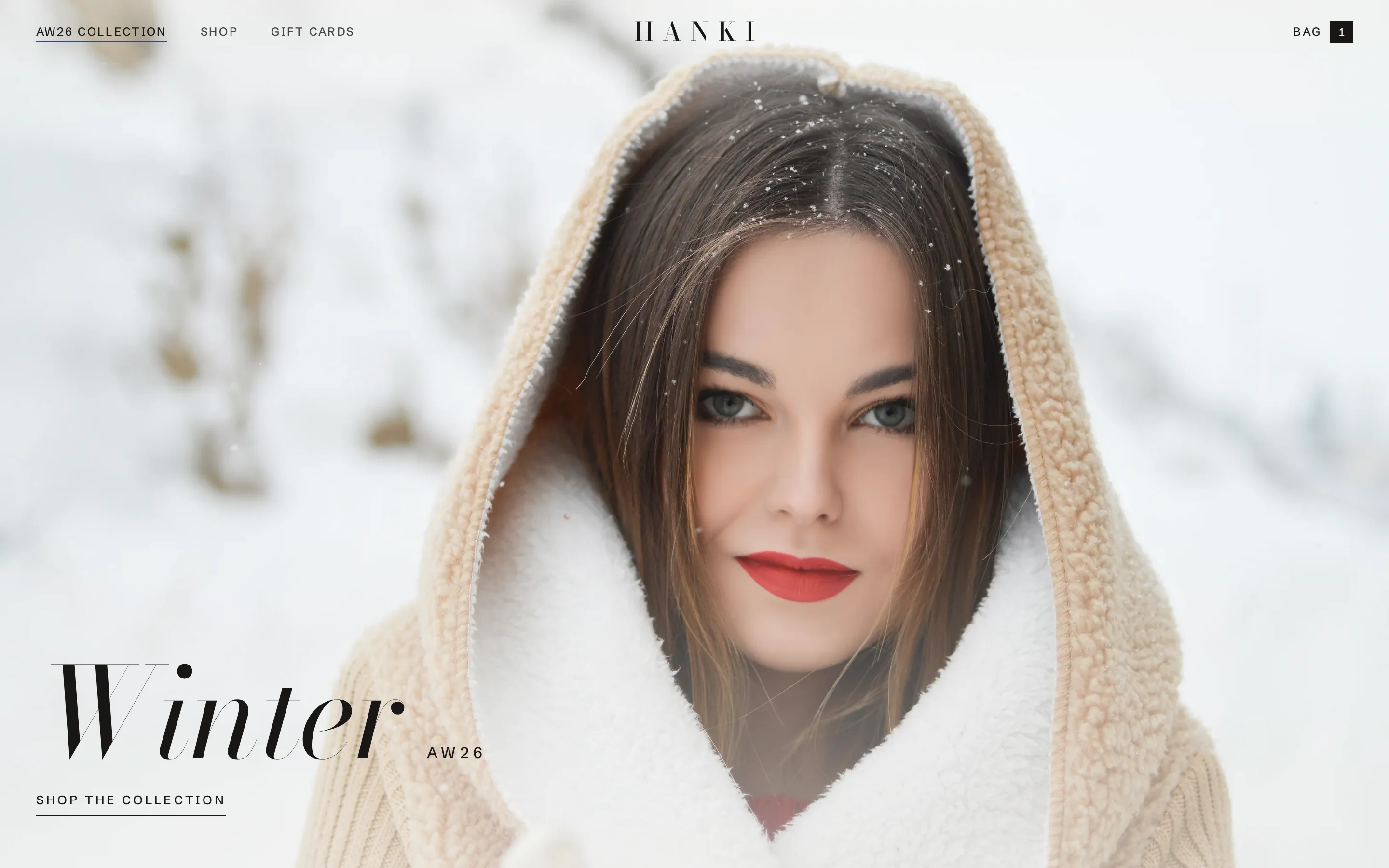
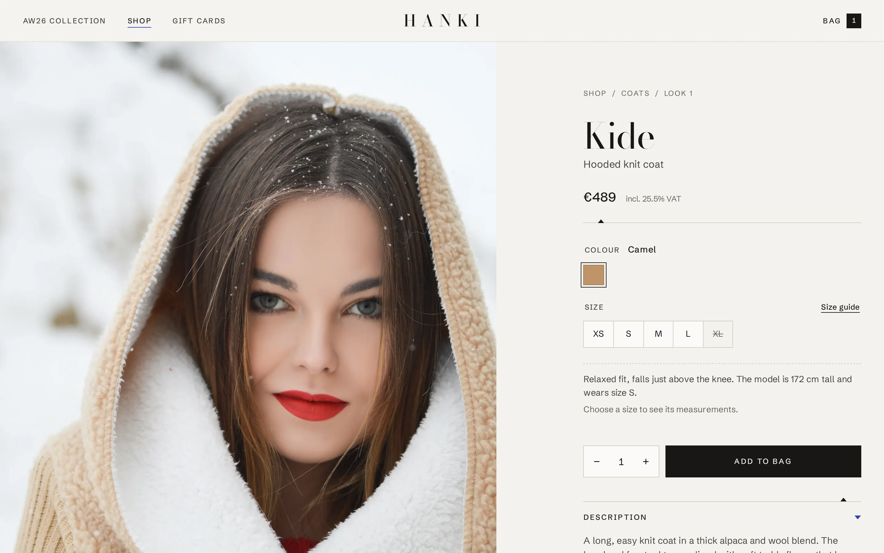
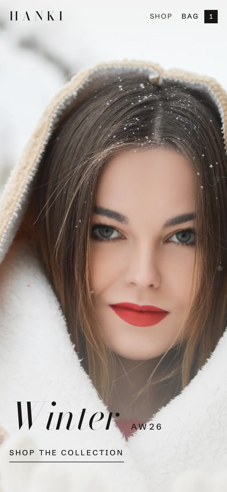
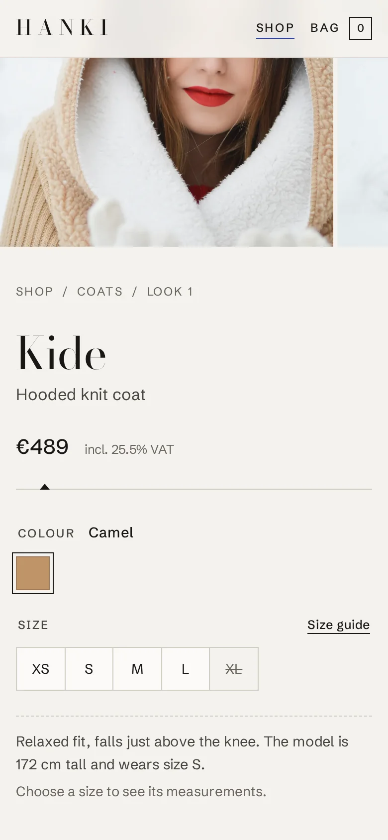
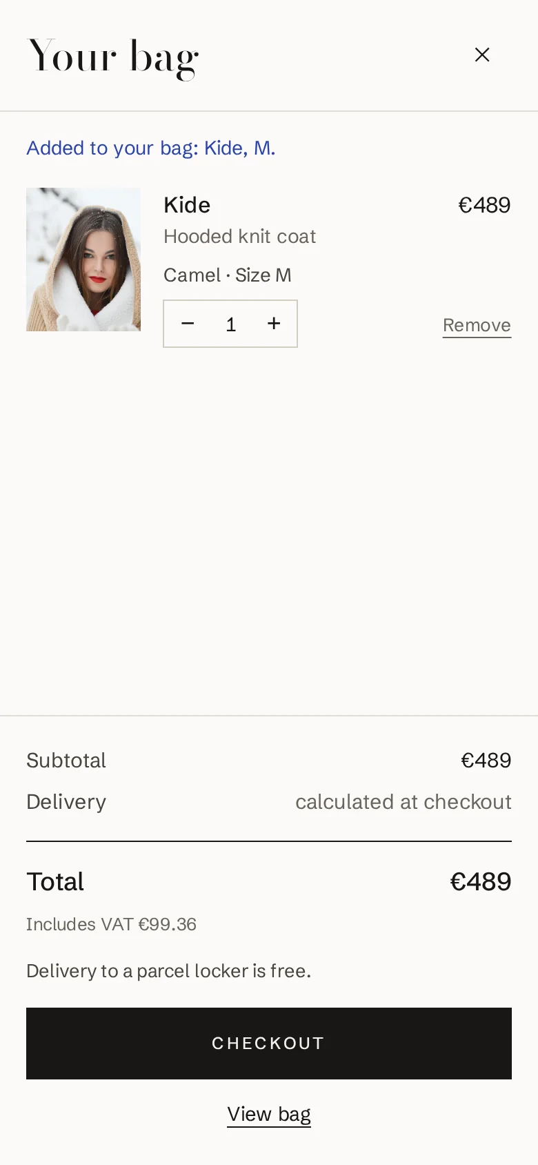
The shop really works: pick a size, try the code DEMO10 and pay with a test payment. No money is taken and nothing is shipped.
Try the finished shop07Testing
Finally, we measure. These numbers were measured on this shop.
Testing shows what works, and also what still needs work. That's why we show the number that isn't on target yet, too.
Contrast
| Sample | Used for | Ratio | WCAG |
|---|---|---|---|
| #181716 / #f4f2ee | Text | 16.0:1 | AAA |
| #48443f / #f4f2ee | Secondary text | 8.6:1 | AAA |
| #69645d / #f4f2ee | Hints and VAT lines | 5.2:1 | AA |
| #2b44ad / #f4f2ee | Stock and discount notes | 7.4:1 | AAA |
| #f4f2ee / #181716 | Button label | 16.0:1 | AAA |
| #ffffff / #2b44ad | Button on hover | 8.3:1 | AAA |
| #a1261c / #f4f2ee | Error messages | 6.7:1 | AA |
| #69645d / #fbfaf7 | Hints on paper | 5.6:1 | AA |
Worked out from the colours in the shop's stylesheet with the WCAG 2 formula. Normal text needs at least 4.5:1.
Measurements
Keyboard
From a product page through choosing a size and the bag to the checkout, keyboard only. The focus was visible at 21 of 21 stops.
24 key presses
Screen sizes
Screens 390, 768, 1,024, 1,280, 1,440, 1,920, 2,560 px wide. Front page, shop, product page, bag and checkout: 35 combinations, no sideways scrolling in any of them.
35/35 without sideways scrolling
Loading on a phone
The front page's largest picture was ready in 3.6 seconds on a simulated slow 4G connection with a processor slowed down four times (0.7 MB, 14 files). Google's line for good is 2.5 s, so there is still work to do here: the phone cover photo can be made lighter.
3.6 s
Loading on a computer
The same measurement on a fast line (10 Mbit/s, 40 ms latency): 0.8 MB, 16 files.
0.43 s
The purchase path
An automated browser test runs the whole path in Finnish and English: the required size, the bag, a wrong and a right discount code, checkout errors, the test payment, stock going down and no email being sent for orders.
7 tests × 2 languages
Measured on 13 October 2026 on a local server running the same code as the live demo. Measurement script: tests/case-measure.mjs.
Want a shop designed like this?
Tell us on a free 20-minute call what you sell and to whom. You get a fixed price before any work starts, and the design is included.