How I made this site
This is how I made this site, from start to finish. I make client sites the same way.
20 stepsThe goal
Professional design, as easy as shopping for new clothes.
Small business owners don't have time for meetings. I wanted ordering a website to be as quick as buying clothes online, with the price shown straight away.
The mood
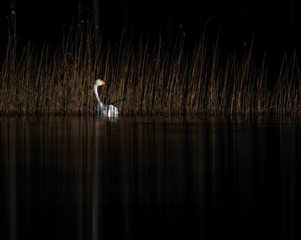
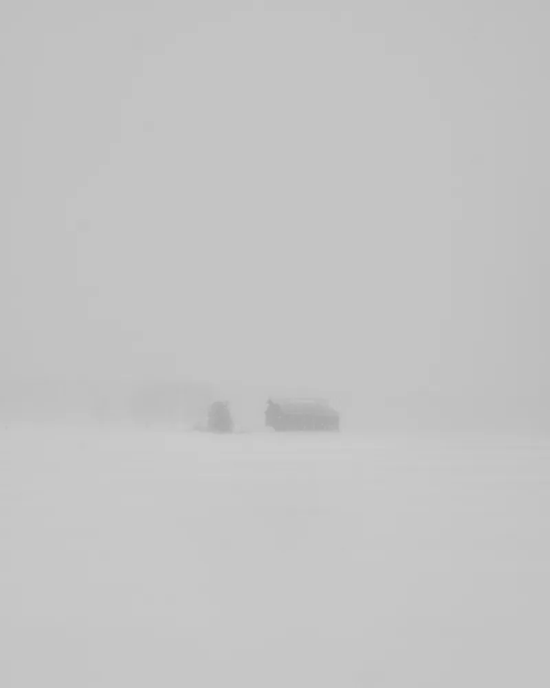
I took the mood from my own photos. I mostly shoot at dusk, with a small subject and lots of empty space around it. I wanted the site to feel the same.


Colours and type
The background is pure black and the text almost white. I only use pink for what you've picked and for the buttons that take you forward. I checked that even the grey text is easy to read on black. The whole site uses one font, Instrument Sans.
- Ground
#000000 - Text
#F2F0F118,5 : 1 - Secondary
#8A878B5,9 : 1 - Picked and the way on
#E45F9B6,4 : 1 - The mark
#E98FAE9,0 : 1
Instrument Sans
The mark
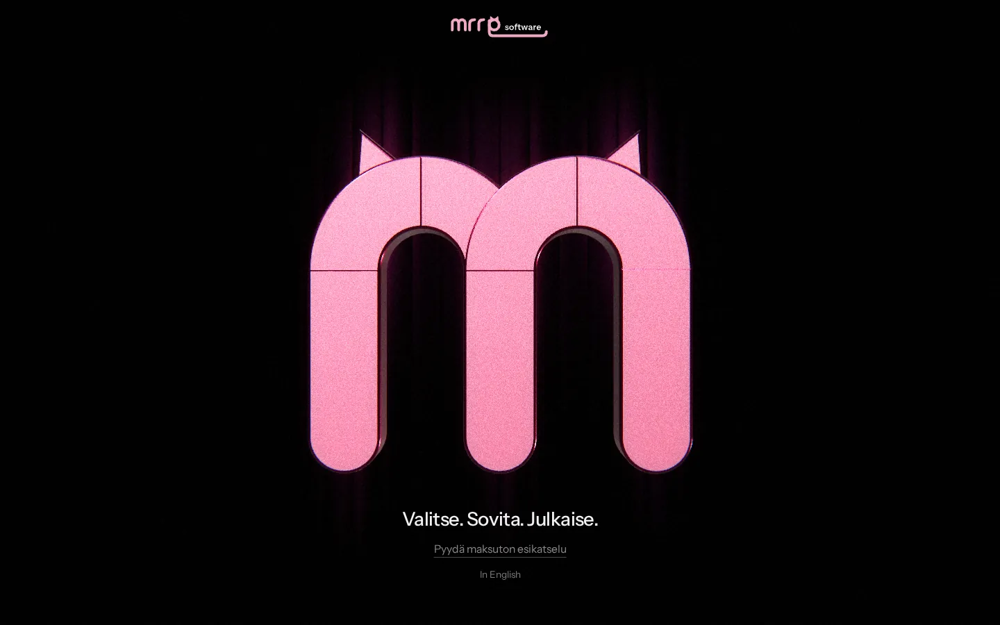
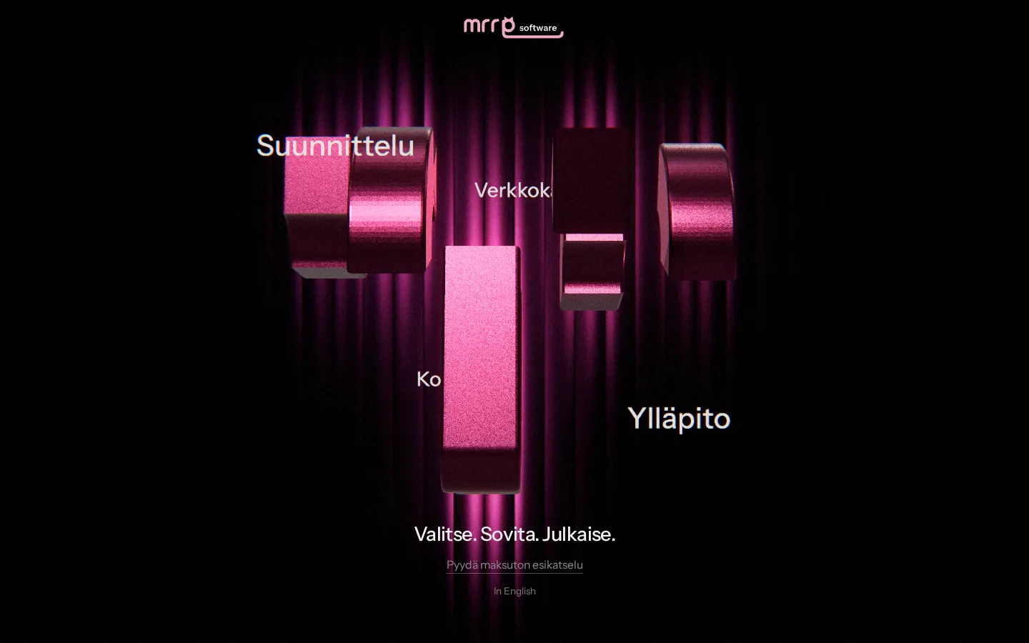
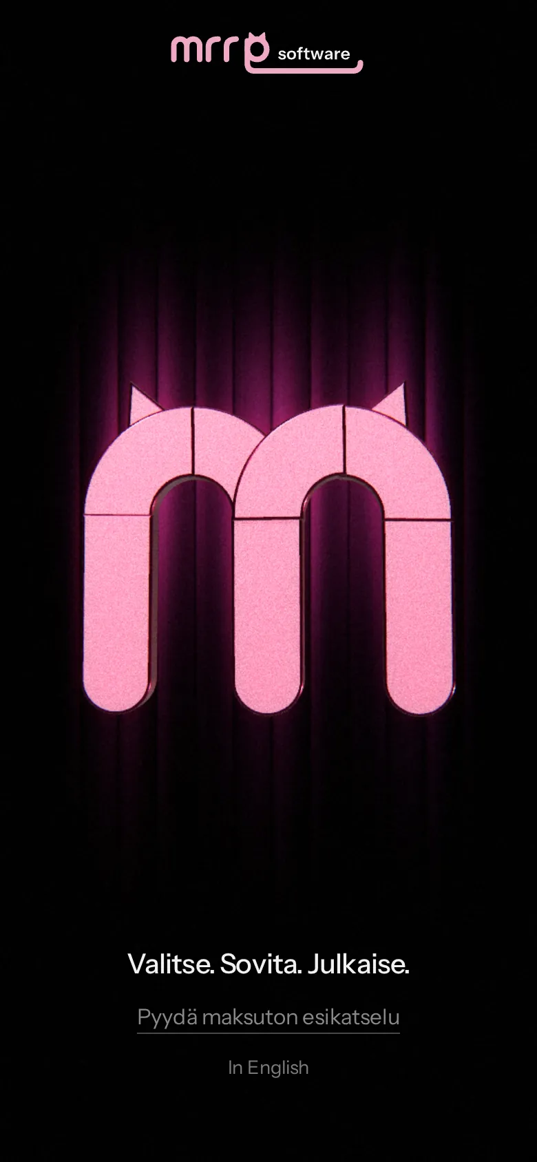
The Mrrp cat's m is a 3D model made of nine pieces. Move your mouse to the side and the pieces open up, showing what I do in between them.
The shop
Usually you ask for a quote for a website and then wait. I turned ordering into a shop where you answer a few questions and see the price the whole time. It doesn't ask about the look, because designing that is my part.
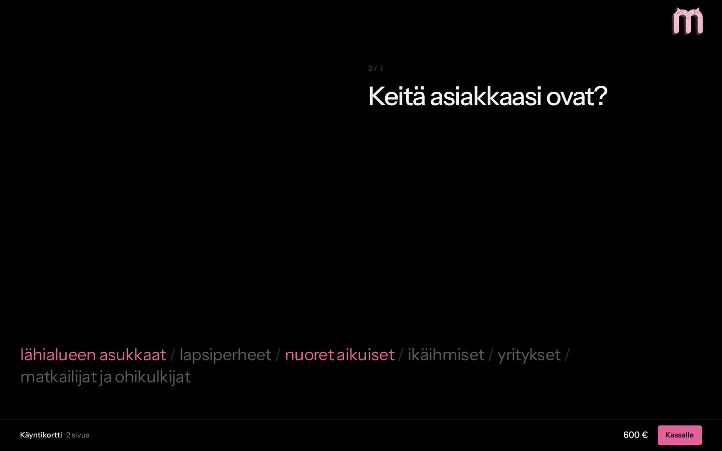
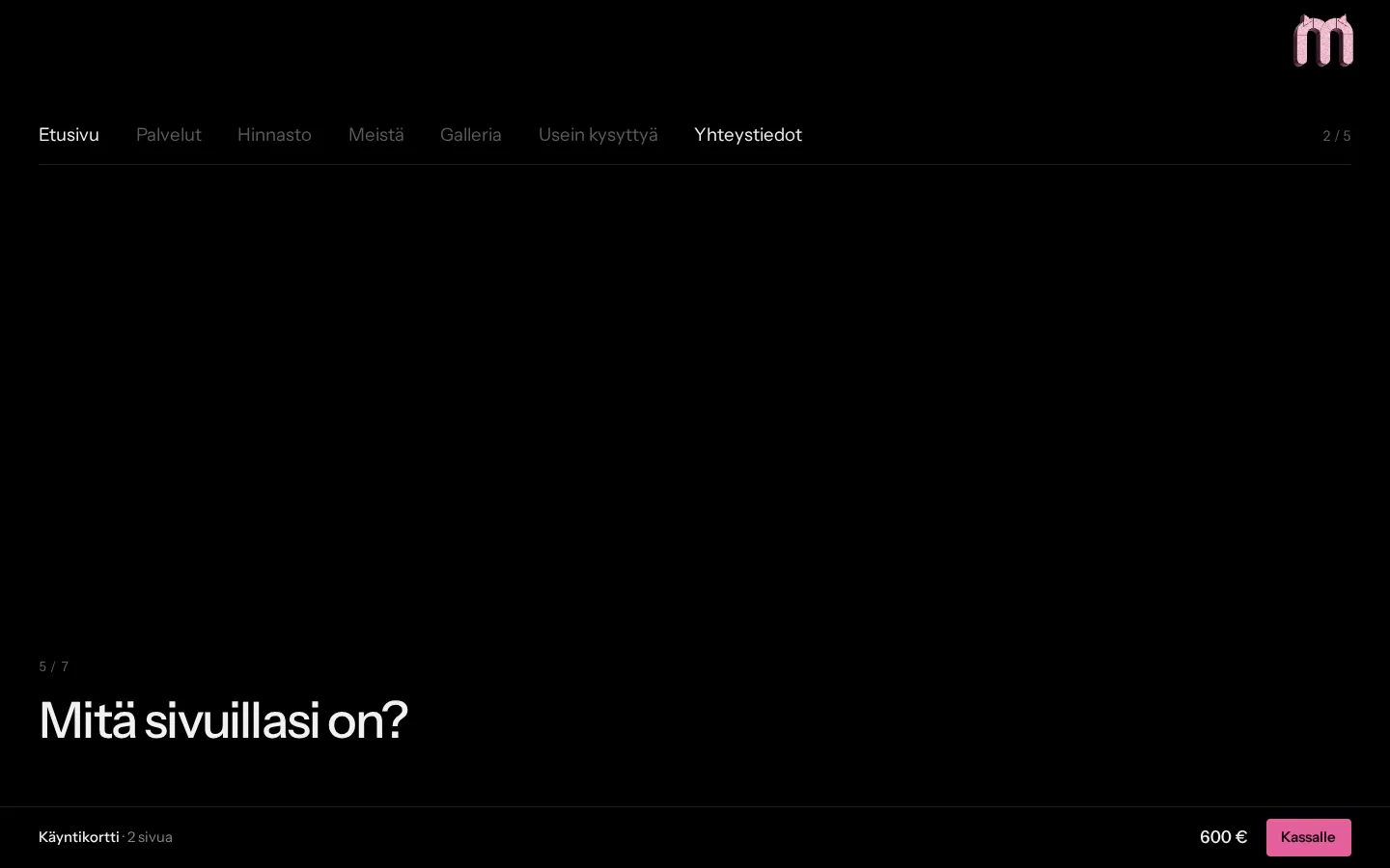
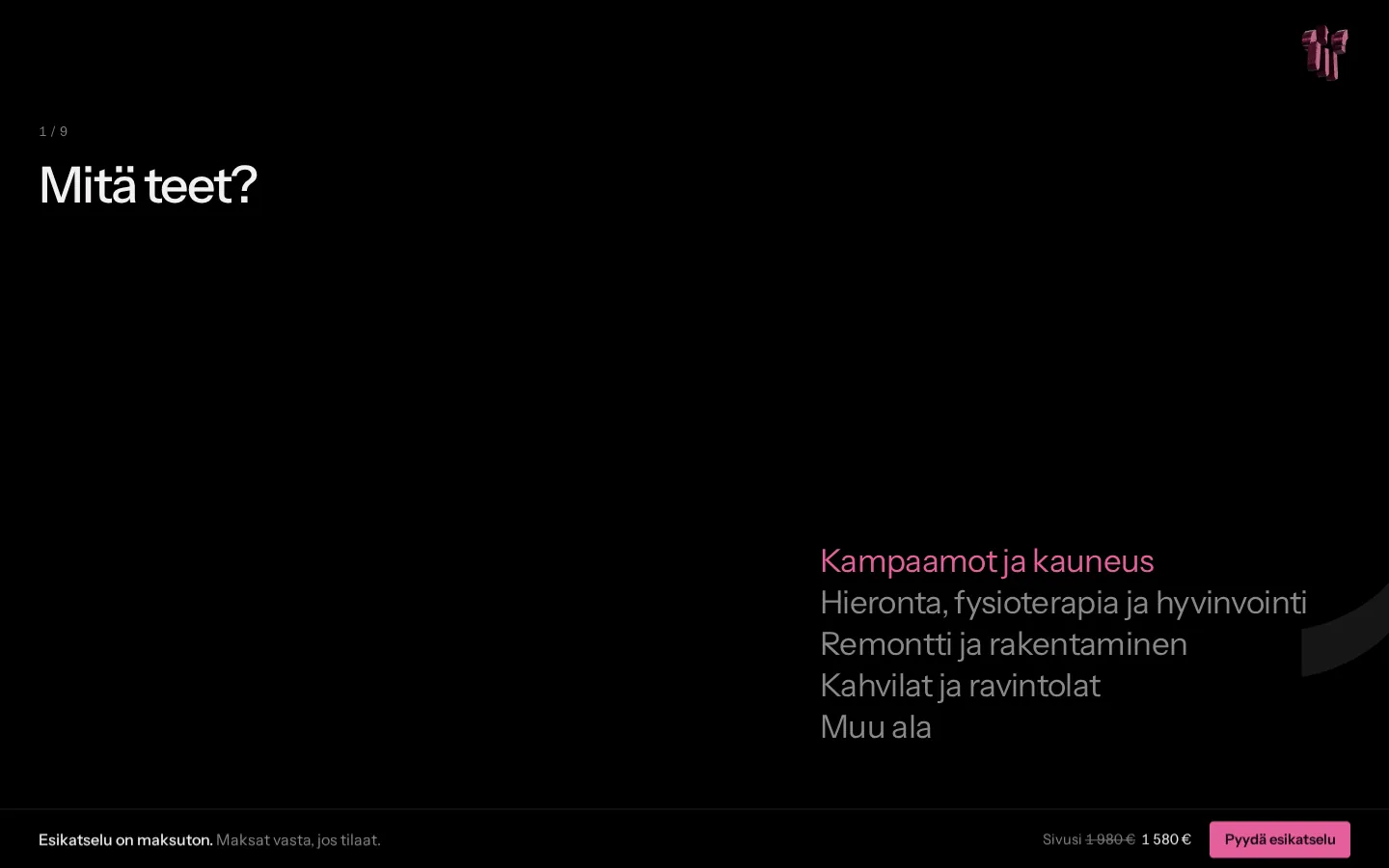
Structure
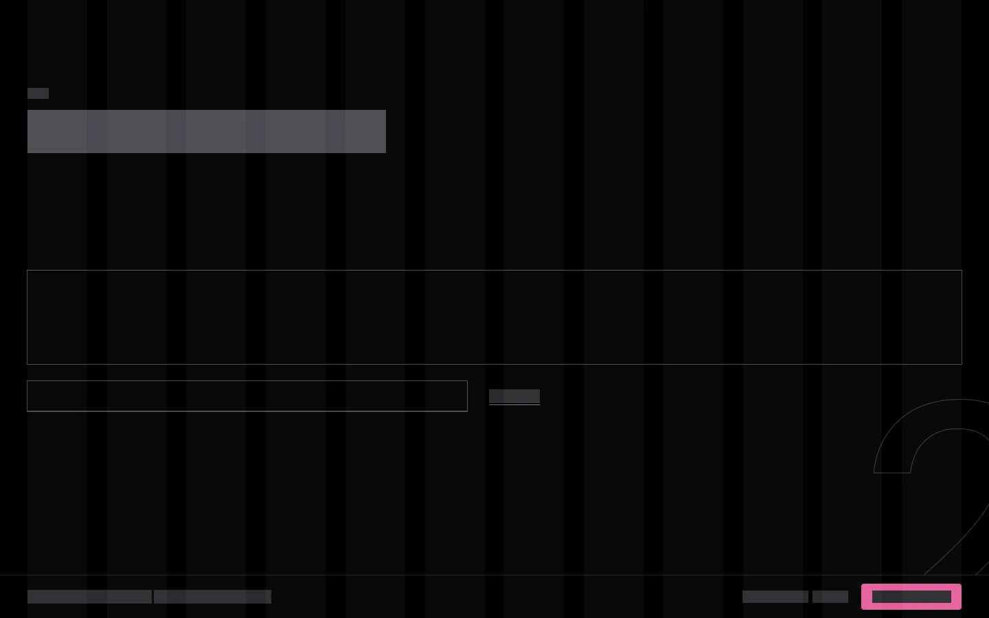
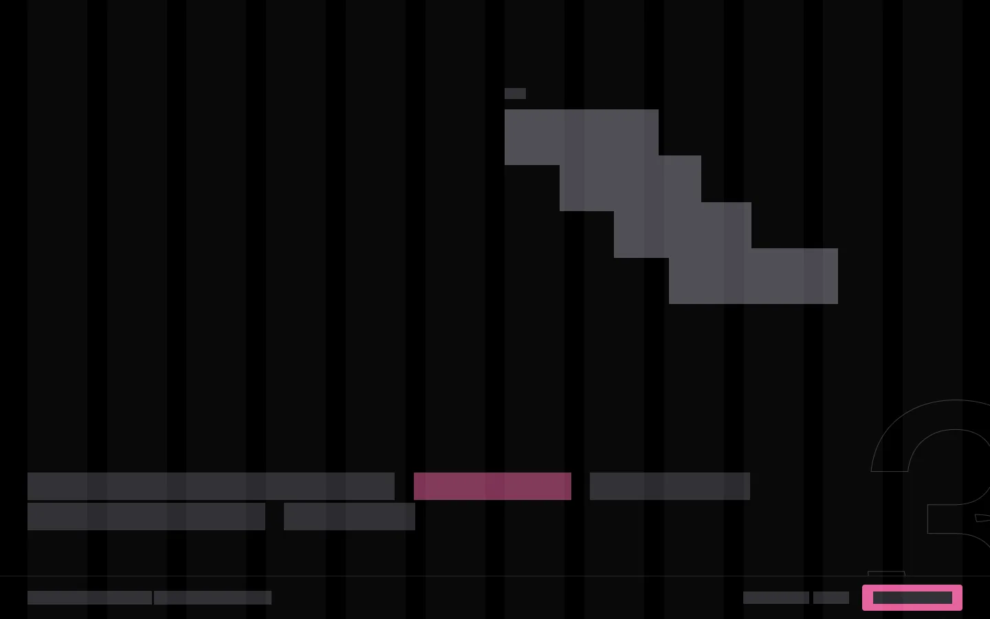
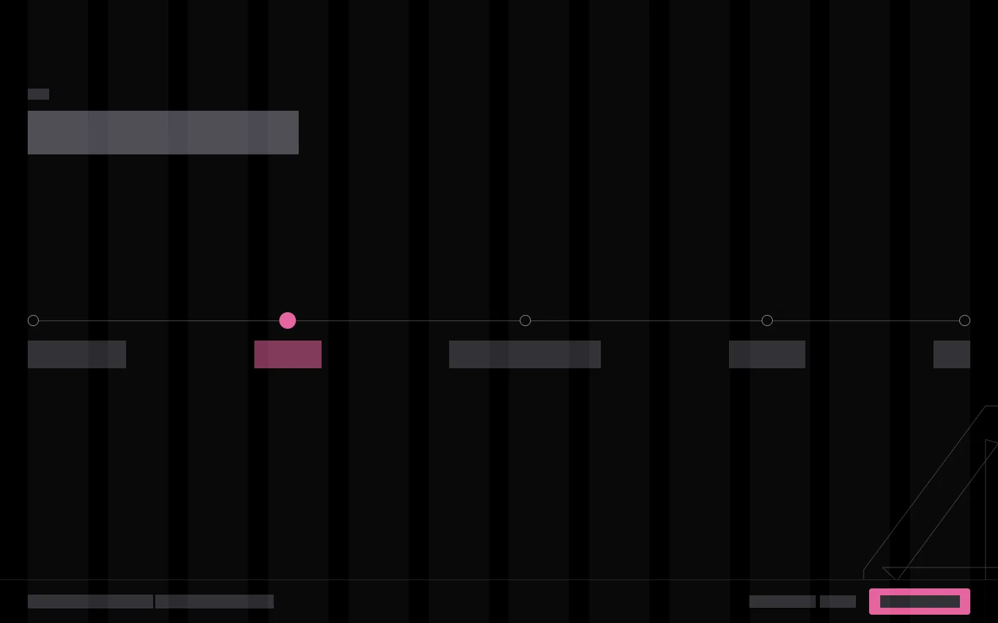
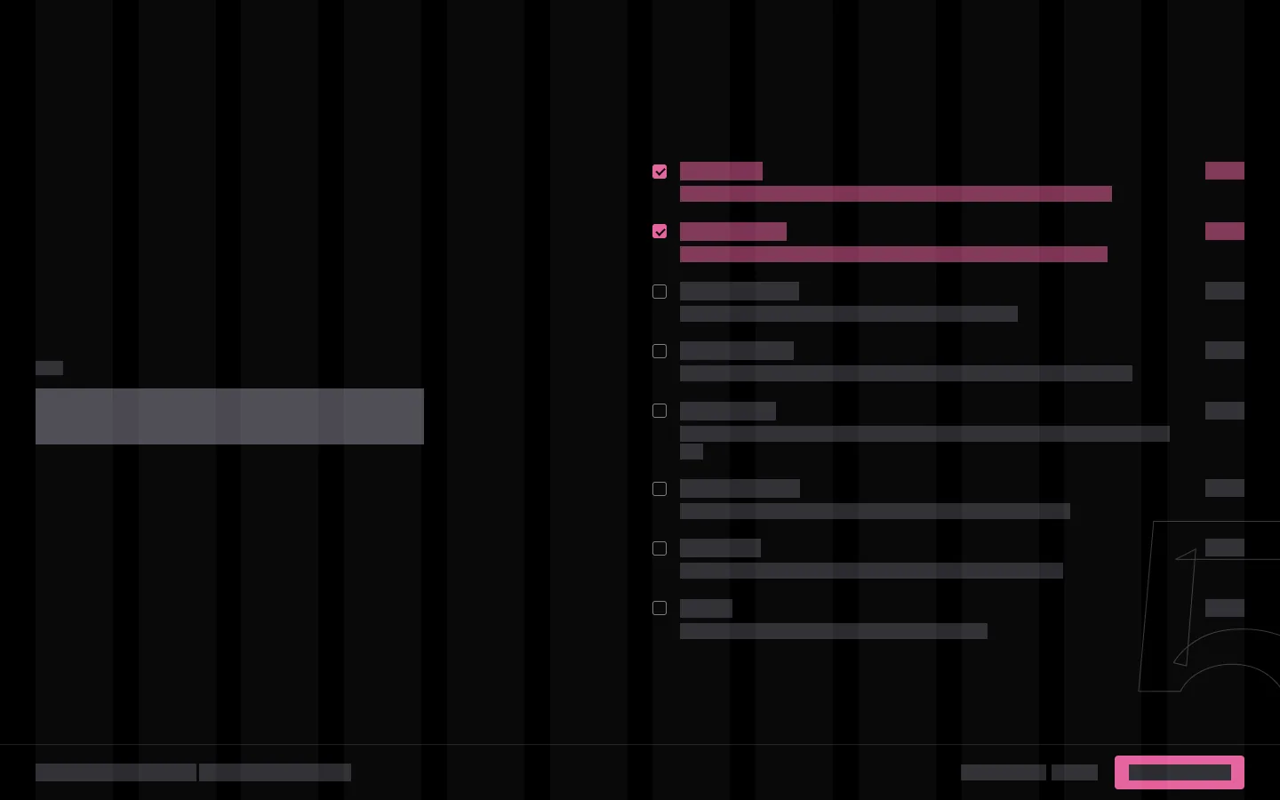
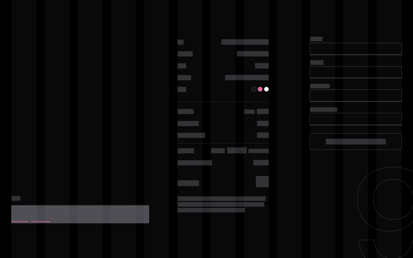
Before any colour, I wireframed every screen. The grid has 12 columns, and the question sits somewhere different on each screen so scrolling doesn't feel the same every time. These are the shop's real screens with the text taken out.
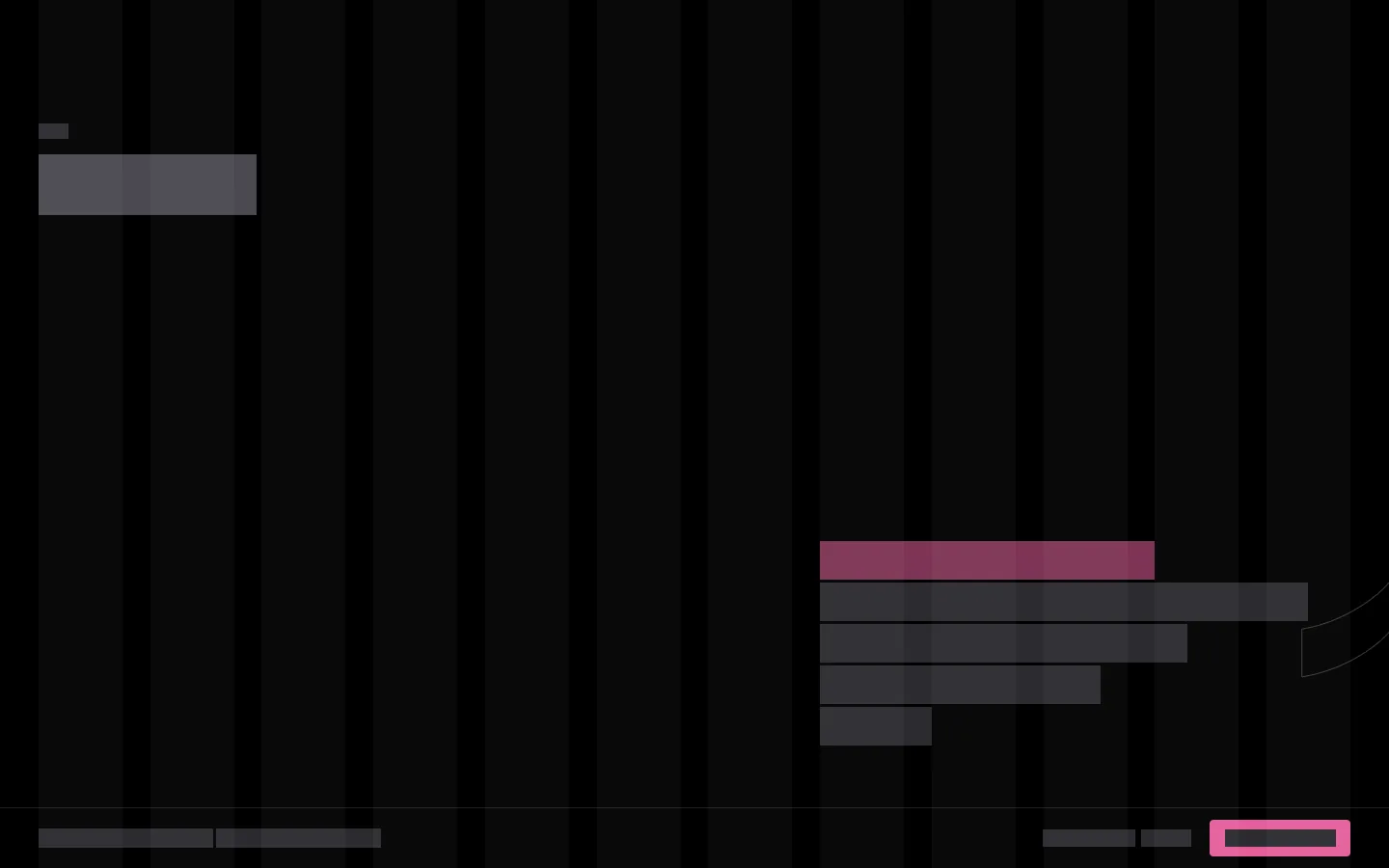
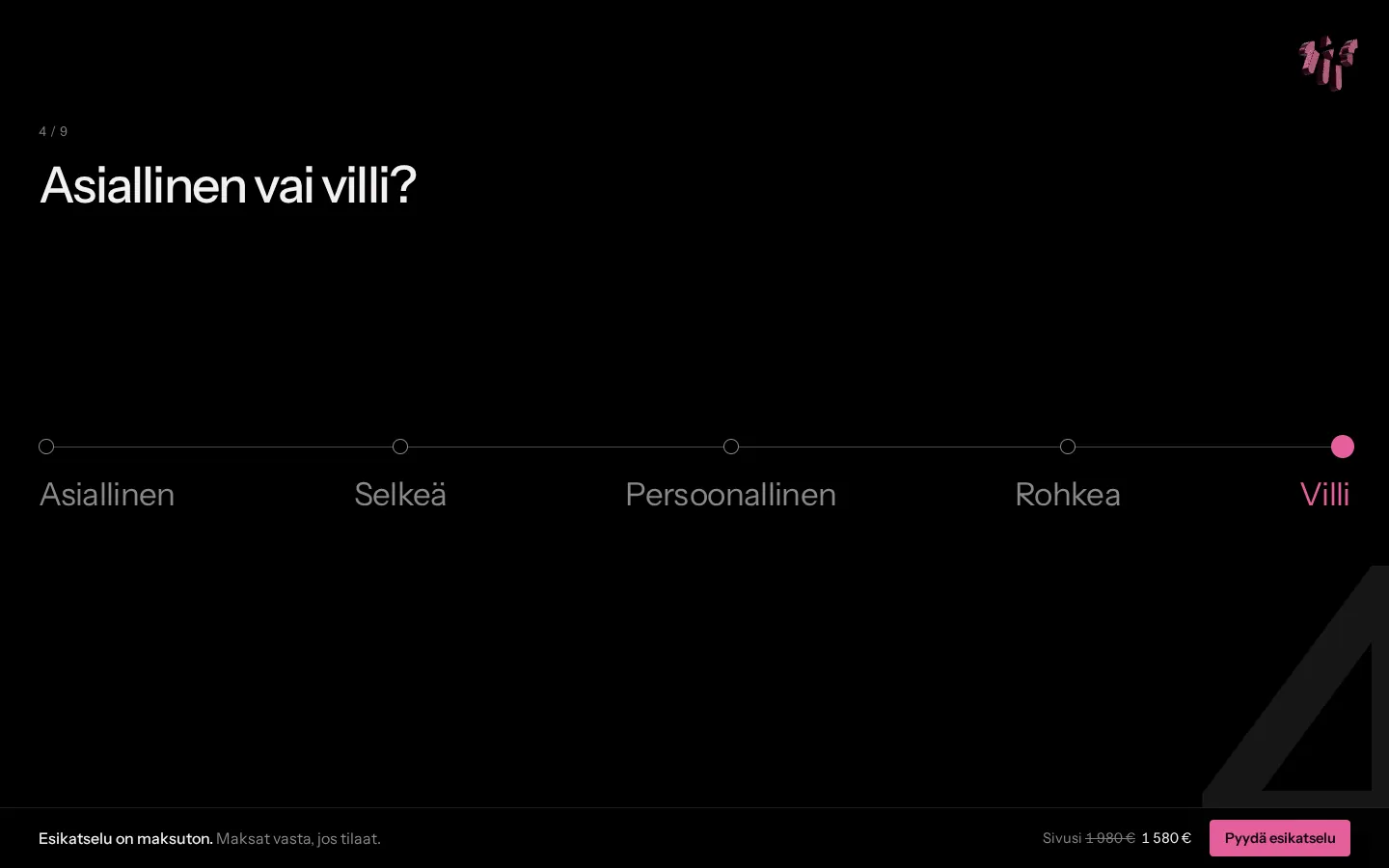
Businesslike or wild?
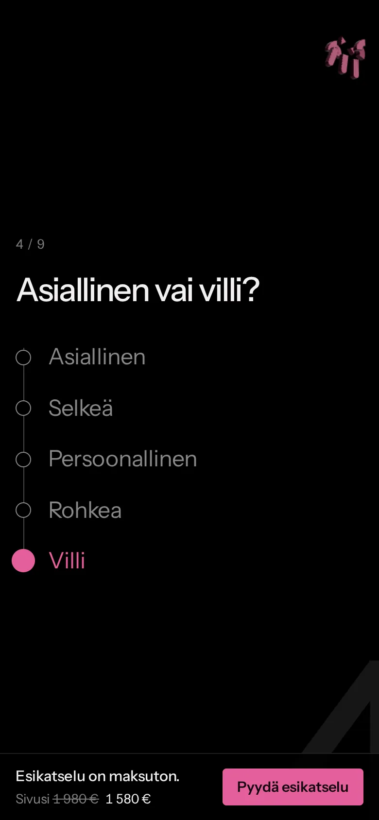
I don't ask about colours or fonts, because hardly anyone wants to pick those. I just ask how bold the site can be. The wilder you go, the more the m in the corner opens up and tilts.
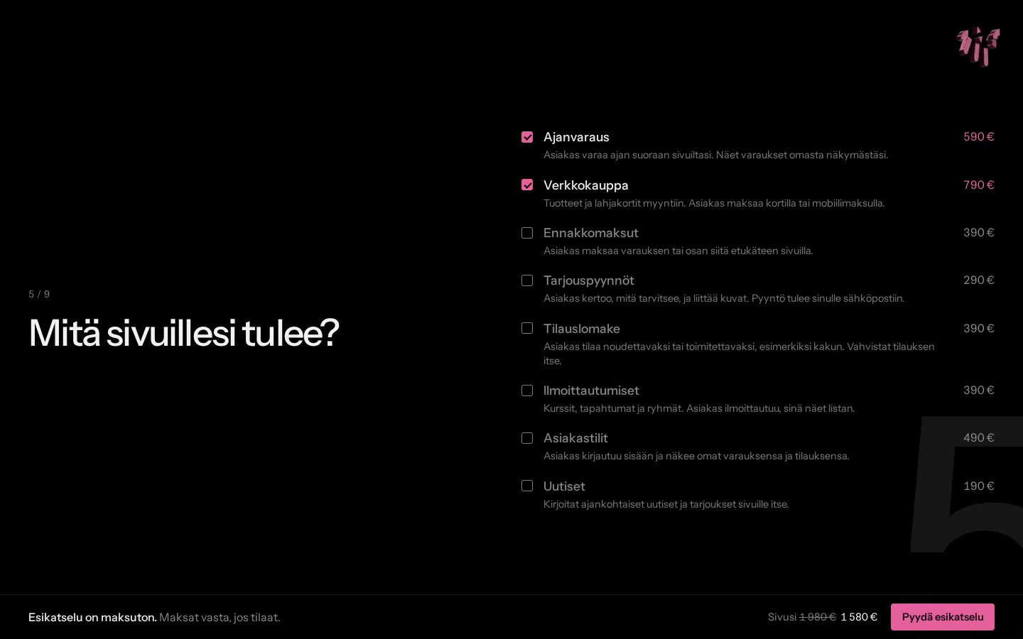
Prices in plain words
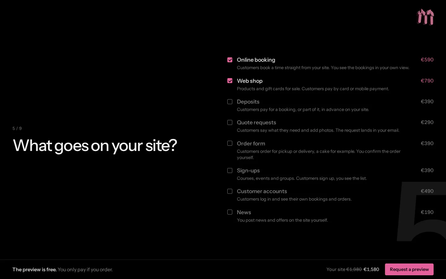
Every add-on says in a line what it does and what it costs. The bar at the bottom always shows that the preview is free and what the site would cost.
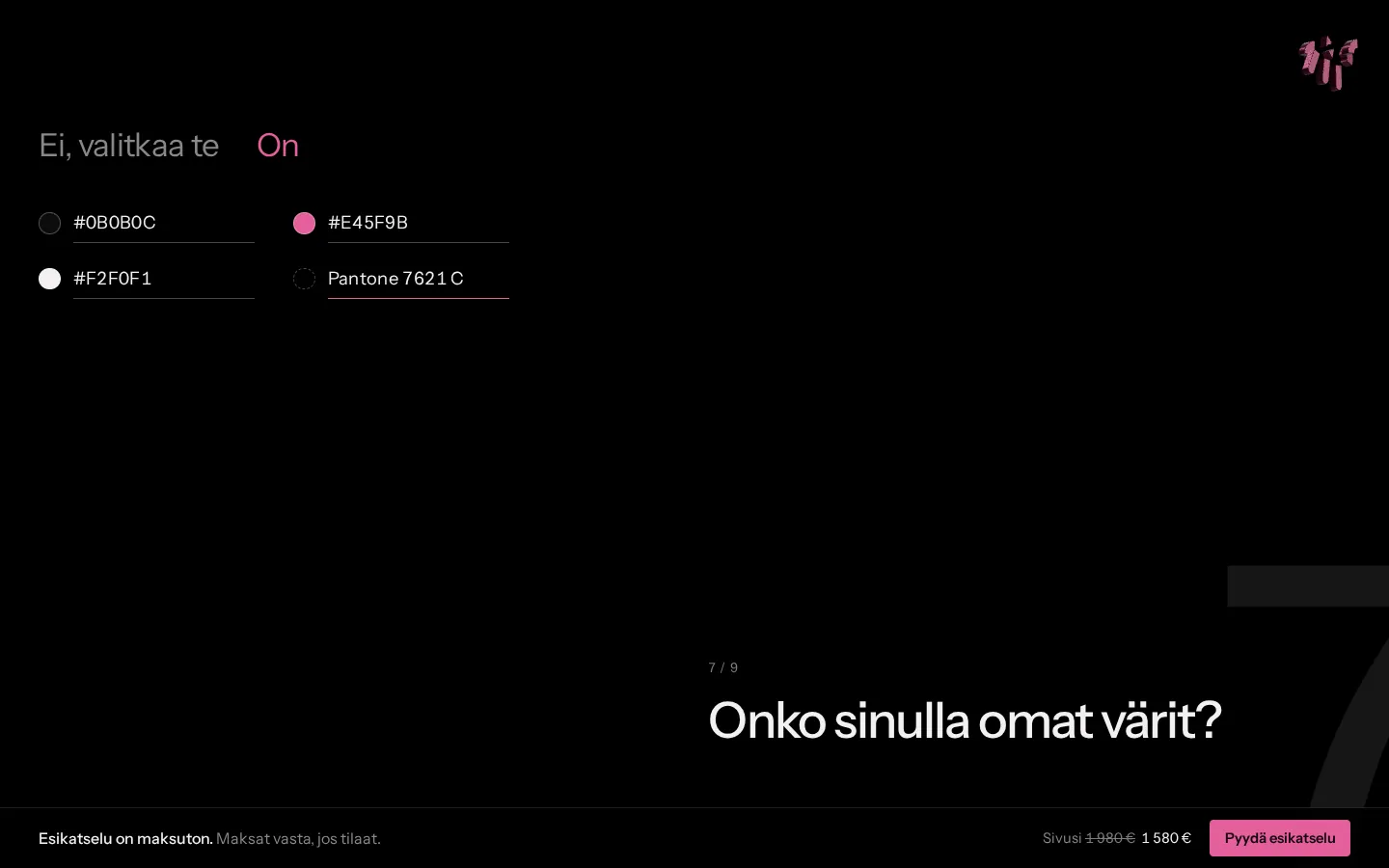
Exact colours
If a business already has its own colours, I need the exact codes. So I ask for a hex, rgb or Pantone code instead of offering a colour picker.
The promise
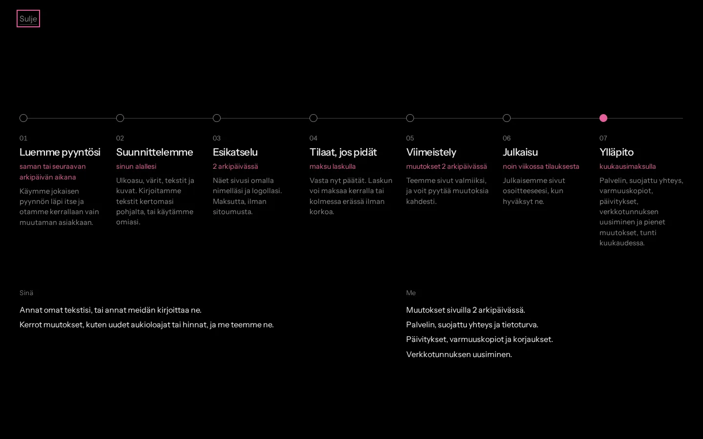
At the till you can click the words “the rest”. It opens the whole process from request to upkeep, with timings, and says what you do and what I do.
The path
I counted what a request actually needs. One pick, five fields and a button are enough, and everything else is already filled in. I also checked you can send it using only the keyboard.
- pick
- 1
- fields
- 5
- button
- 1
- page loads
- 0
Tried on 17 Oct 2026.
Photographs
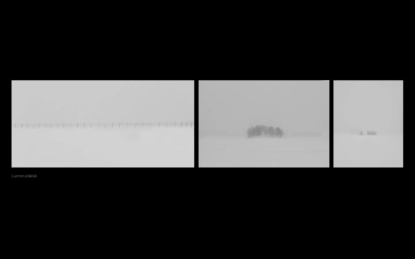
The page about me is built from my photo sets. In the snowstorm set you first see the barn through a small window, and as you scroll the view pulls back to the whole set.

Motion from your answers
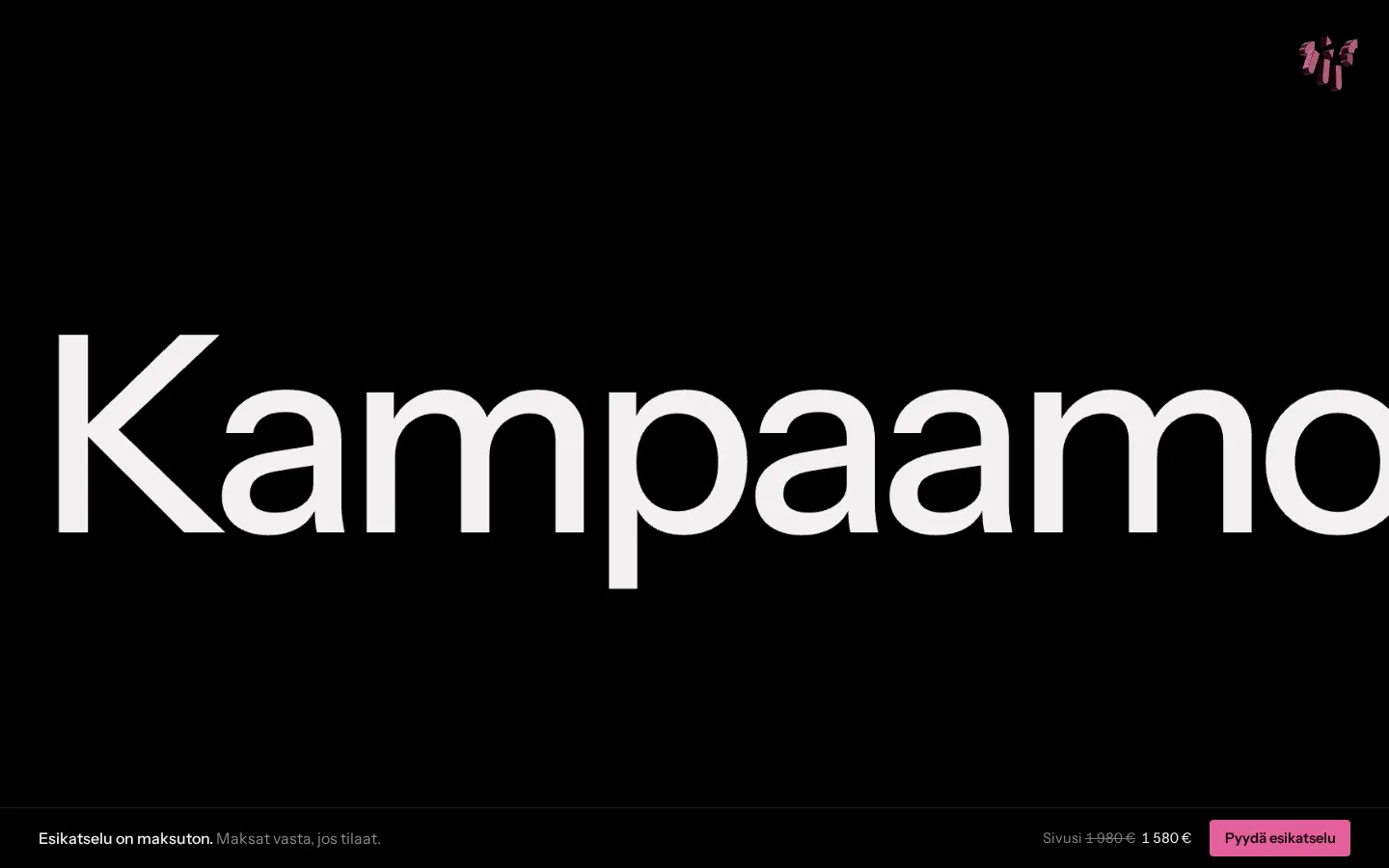
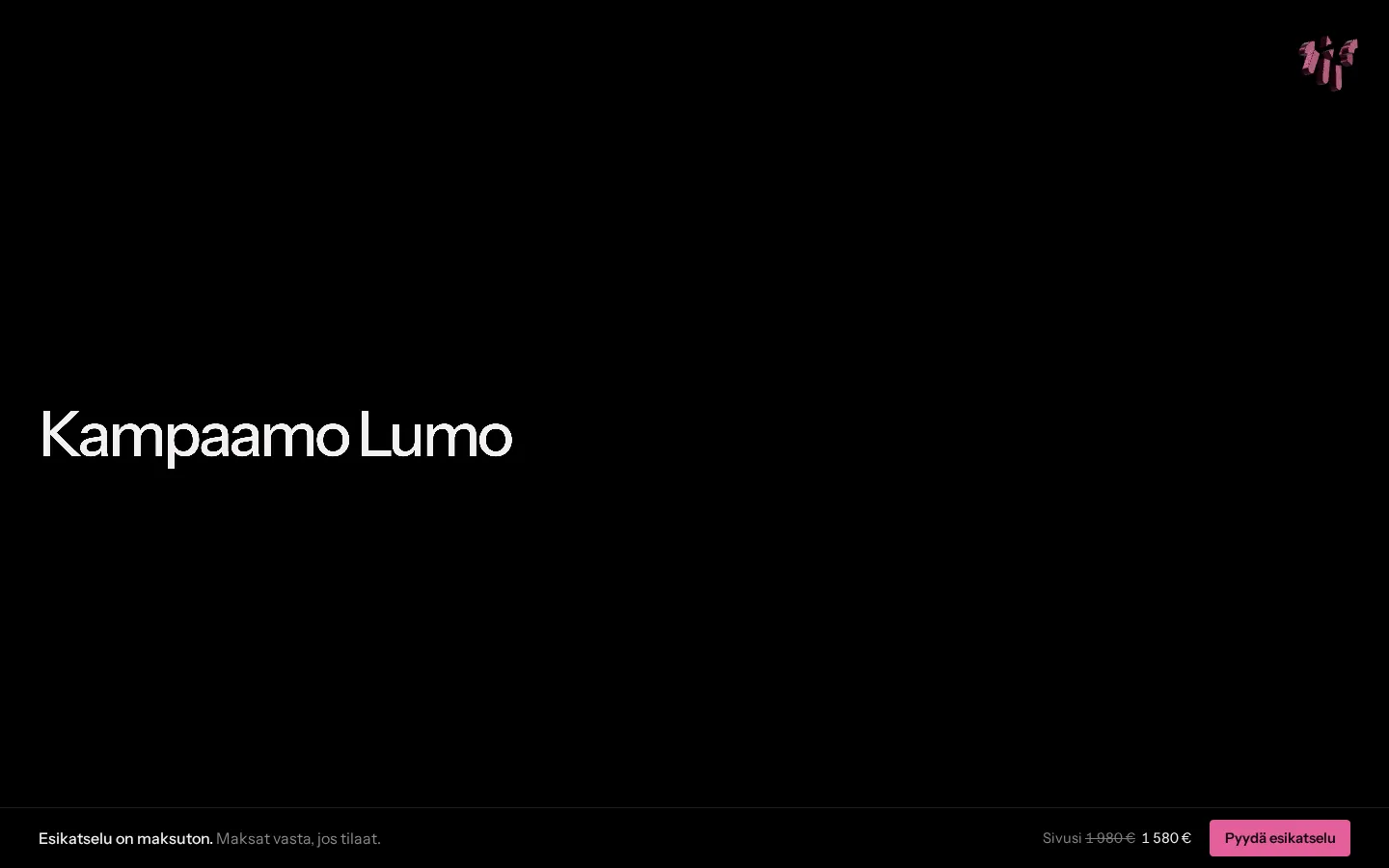
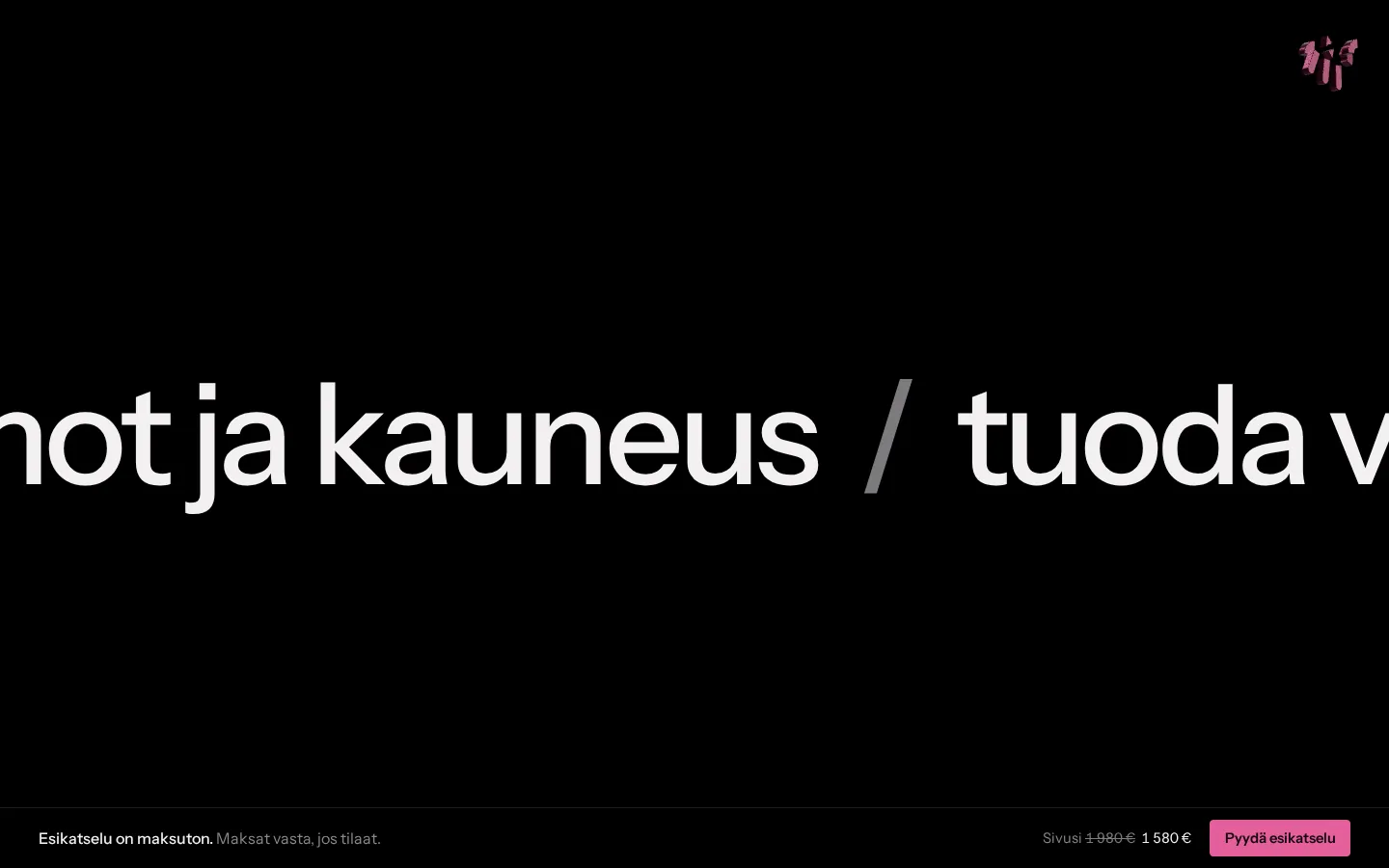
There are two spots where the scrolling pauses for a moment. In the first, your business name shrinks from huge to logo size. Before the till, your answers slide past as one long line.
Rules broken on purpose
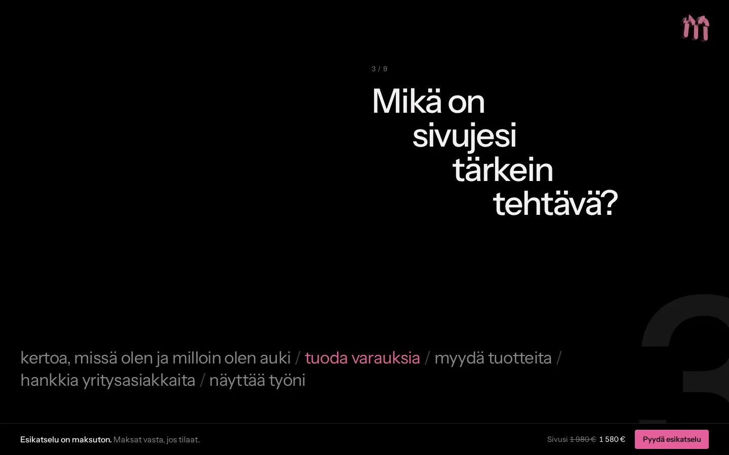
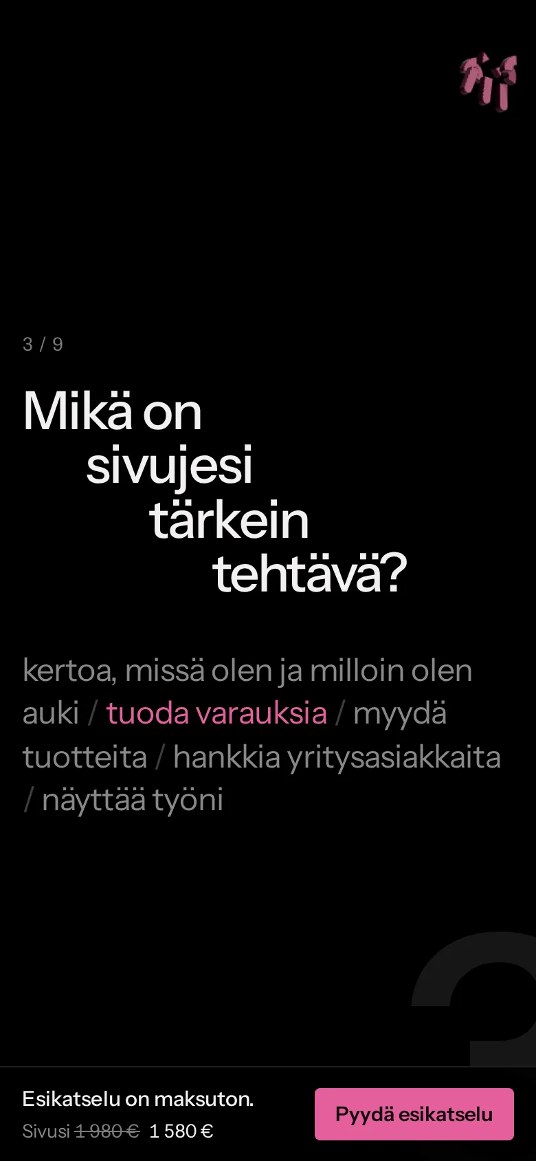
I broke a few design rules on purpose. One question is set out like stairs, and the screen numbers are so big they run off the edge. The price and the buttons I still kept clear.
Two languages
The shop works in Finnish and English. Both get their prices from the same place, so they always match, right through to the invoice.
On a phone
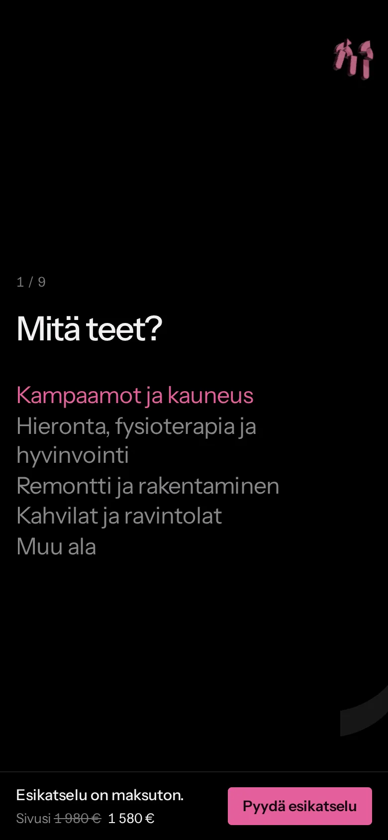
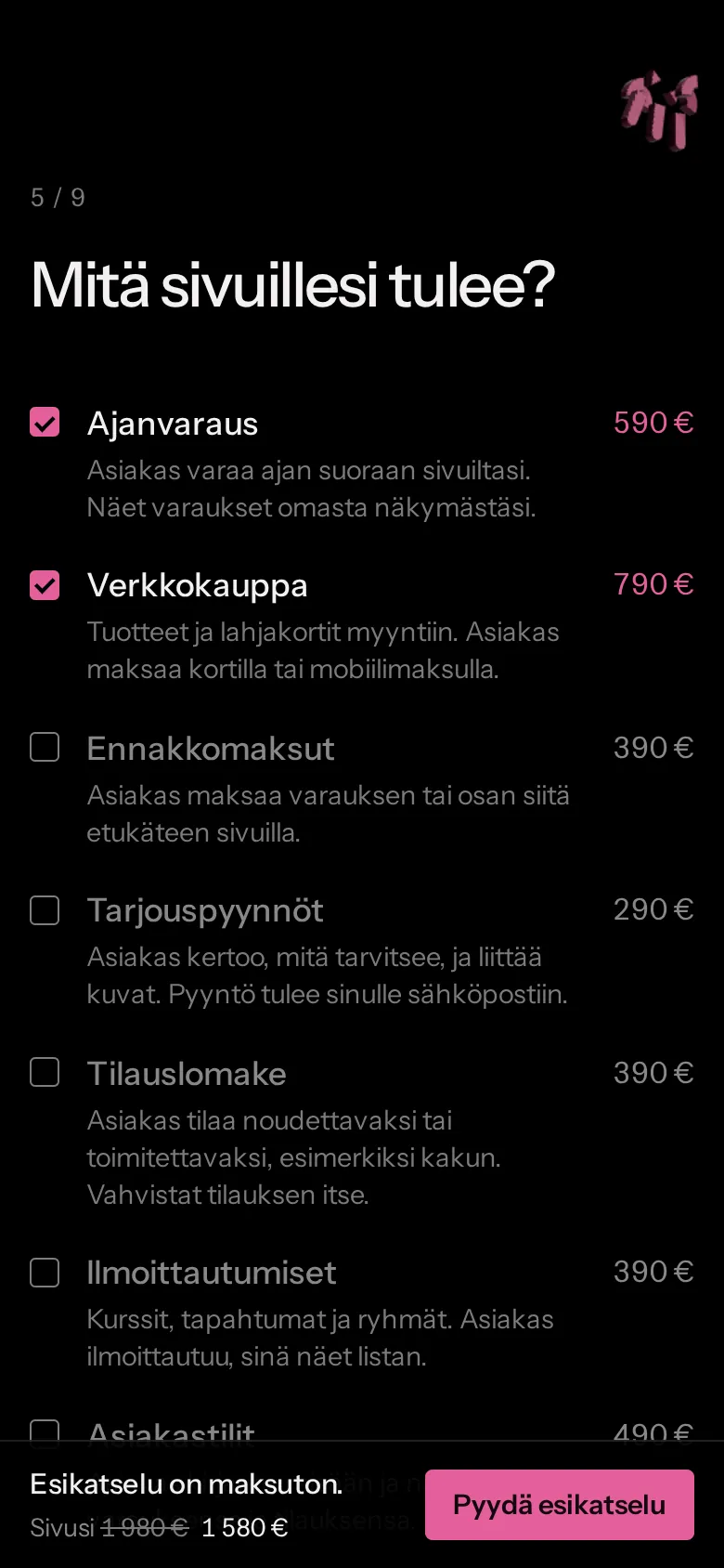
On a phone the shop works the same way. The scale turns upright, and the preview button stays at the bottom where your thumb can reach it.
Tried in use
I went through the site on a 4K monitor and a phone and fixed anything that felt off. Here are some of them.
| Found | Fixed |
|---|---|
| Smoothed scrolling felt like sliding on ice. | Switched to normal scrolling that snaps gently into place. |
| The name shrinking stuttered and took many scrolls. | Now only the size changes, and it takes less scrolling. |
| Without a name, an empty placeholder flashed. | If there's no name, that part is left out. |
| Refreshing the page flashed the mark for a moment. | The mark only gets drawn once the page has settled. |
| A huge price at the till took the eye off the preview. | Took the huge price out. It's shown small, and the free preview comes first. |
| The language switch in the corner broke the entrance's symmetry. | Moved it to the middle, under the main link. |
| Lighthouse: screen readers had no main region. | Added it, and accessibility went up to 100. |
Under the hood
I built the site without a site builder or a ready-made theme. Here's what's under it and why.
| Part | What I used |
|---|---|
| Pages | A Node script I wrote turns every page into a finished HTML file. There's no framework, so the browser doesn't get sent anything it doesn't need. |
| Styles | Plain CSS and one font, Instrument Sans, loaded from my own server instead of Google's. |
| JavaScript | Only where something moves or gets calculated, like the price. The form is a normal HTML form, so keyboards and screen readers just work with it. |
| The 3D mark | three.js, bundled with esbuild. If a device can't do 3D, a plain logo shows instead. |
| Server | Cloudflare Workers. Pages come from the Cloudflare server nearest the visitor, and the same Worker handles orders, prices and the order pages. |
| Orders | Stored in Cloudflare Durable Objects, and I get an email for each new one. The server works out prices from the same price list the shop uses. |
| Security | HTTPS everywhere and a strict content security policy (CSP), so the page only runs code I've specifically allowed. |
| Search | The languages are linked to each other (hreflang), with a sitemap and structured data. IndexNow tells Bing and others about changes right after each release. The site is set up in Google's and Bing's webmaster tools. |
| Stats | Cloudflare Web Analytics counts visits without cookies, so there's no cookie banner. |
| Releases | The code lives in Git and on GitHub. Once the tests pass and I publish, Cloudflare updates the site by itself in about a minute. |
Measured
I measured the site with Google's Lighthouse. On top of that, 80 automated tests check the orders, prices and both languages every time before I publish changes.
- performance
- 92
- accessibility
- 100
- best practices
- 100
- SEO
- 100
- the whole page
- 222 kt
- layout shift
- 0
- tests every release
- 80
- screens: 390, 1440 and 2560 px
- 3
Lighthouse 13, phone settings, a real graphics card, 17 Oct 2026.
Finished
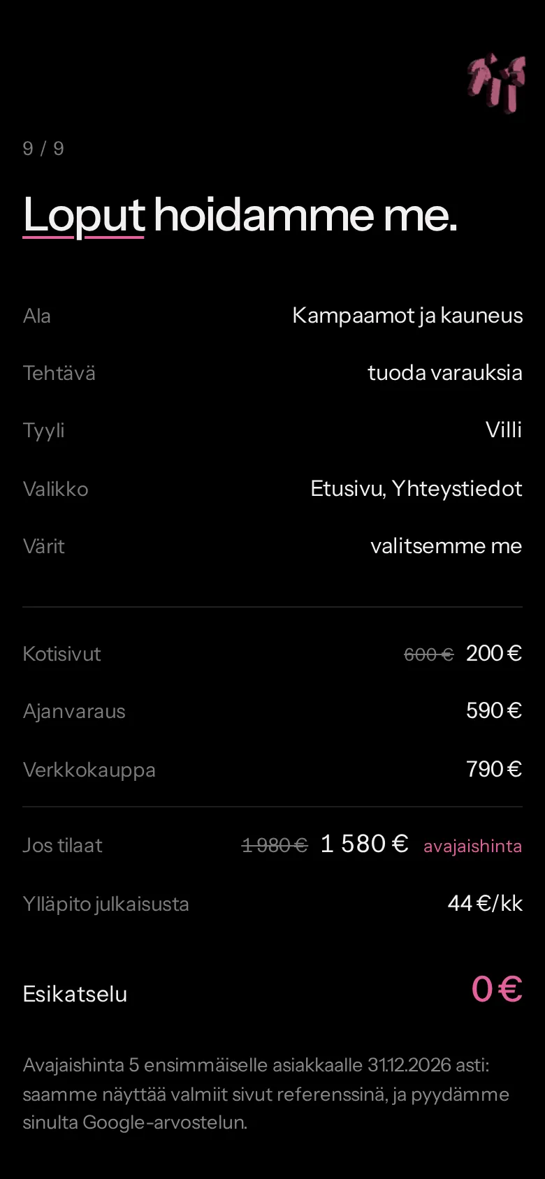
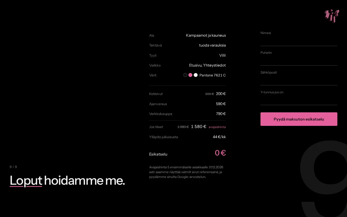
At the till you see everything you picked and what it costs if you order. The preview is free.
Want a site of your own?
The preview is free, and you only pay if you order.
Request a free preview